


Business card design leverages color to evoke emotions and brand identity, with vibrant or muted tones enhancing visual storytelling. Typeface selection plays a crucial role in communicating professionalism and value, from classic fonts like Arial to modern sans-serifs like Montserrat. A well-structured layout with clear hierarchy, contrasting colors, and custom graphics creates an impactful card that instantly conveys brand value and services.
A well-designed business card is a powerful tool to make a lasting first impression. In today’s competitive market, your card should instantly communicate value and professionalism. This article delves into the art of crafting visually appealing business cards, focusing on color choices, typeface selection, and layout strategies that align with your brand identity. By implementing these principles, you can ensure your cards leave a memorable impact, turning simple exchanges into meaningful connections.
- Choosing Colors That Reflect Your Brand Instantly
- Typeface Selection: Conveying Professionalism Effortlessly
- Layout and Structure for Clear Value Communication
Choosing Colors That Reflect Your Brand Instantly

When designing a business card, color selection plays a pivotal role in instantly communicating your brand’s identity and value. Colors have the power to evoke emotions and create a lasting impression, making them a crucial element in any marketing material, especially a small yet powerful tool like a business card. For instance, vibrant hues can energize and excite, while muted tones convey professionalism and sophistication.
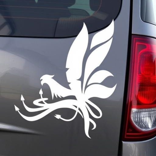
The key is to align your chosen palette with your brand’s personality and the message you wish to convey. Bright, bold colors might suit innovative startups or creative agencies, reflecting a dynamic and forward-thinking image. In contrast, neutral tones with subtle accents can represent established corporations, exuding trust and reliability. Custom graphics and vinyl wraps can also enhance this visual storytelling by adding unique patterns or brand logos, ensuring your business card stands out in someone’s hand or on their desk, leaving a memorable impression that reflects the value of your services or products.
Typeface Selection: Conveying Professionalism Effortlessly

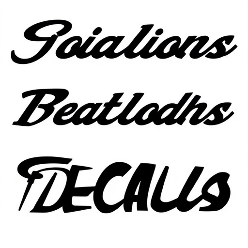
Choosing the right typeface is a subtle yet powerful element in business card design that can instantly communicate professionalism and value. Opting for classic, clean fonts like Arial, Helvetica, or Calibri exudes a sense of trustworthiness and sophistication. These typesets are easily readable across various media, ensuring your contact information remains clear even when printed on high-quality cardstock or seen from afar in digital formats.
Moreover, incorporating modern sans-serif fonts can add a touch of contemporary elegance to your business card design. Consider fonts like Montserrat or Roboto, which offer a sleek appearance while still maintaining legibility. This strategic typeface selection not only enhances the visual appeal but also subtly suggests that your brand is innovative and forward-thinking—a valuable asset in any industry, whether you’re offering vehicle protection services, heat rejection solutions, or scratch protection for high-end vehicles.
Layout and Structure for Clear Value Communication

A well-designed business card goes beyond aesthetics; it’s a powerful tool to instantly communicate your brand’s value and services. The layout and structure play a crucial role in this communication process. A clean, uncluttered design ensures that essential information is easily scannable, allowing potential clients to quickly grasp who you are and what you offer.
Organize the card with a clear hierarchy: place your company name, logo, and most prominent service or value proposition at the top. Use contrasting colors and fonts to highlight important sections, making it easy for viewers to navigate. For instance, in an automotive detailing business card, you might feature bold graphics depicting sparkling cars alongside concise text describing your UV protection services. Custom graphics can enhance this process, adding a unique touch that makes your card memorable while still maintaining a structured flow of information.
A well-designed business card is more than just a piece of paper; it’s a visual representation of your brand. By strategically choosing colors, typefaces, and a logical layout, you can instantly communicate value and professionalism. Incorporate these design elements to make your cards memorable and ensure they convey the right message about your business. Optimize your business card design for maximum impact and watch as it becomes a powerful tool in networking and building lasting connections.